Creating a more user-centered homepage
Overview
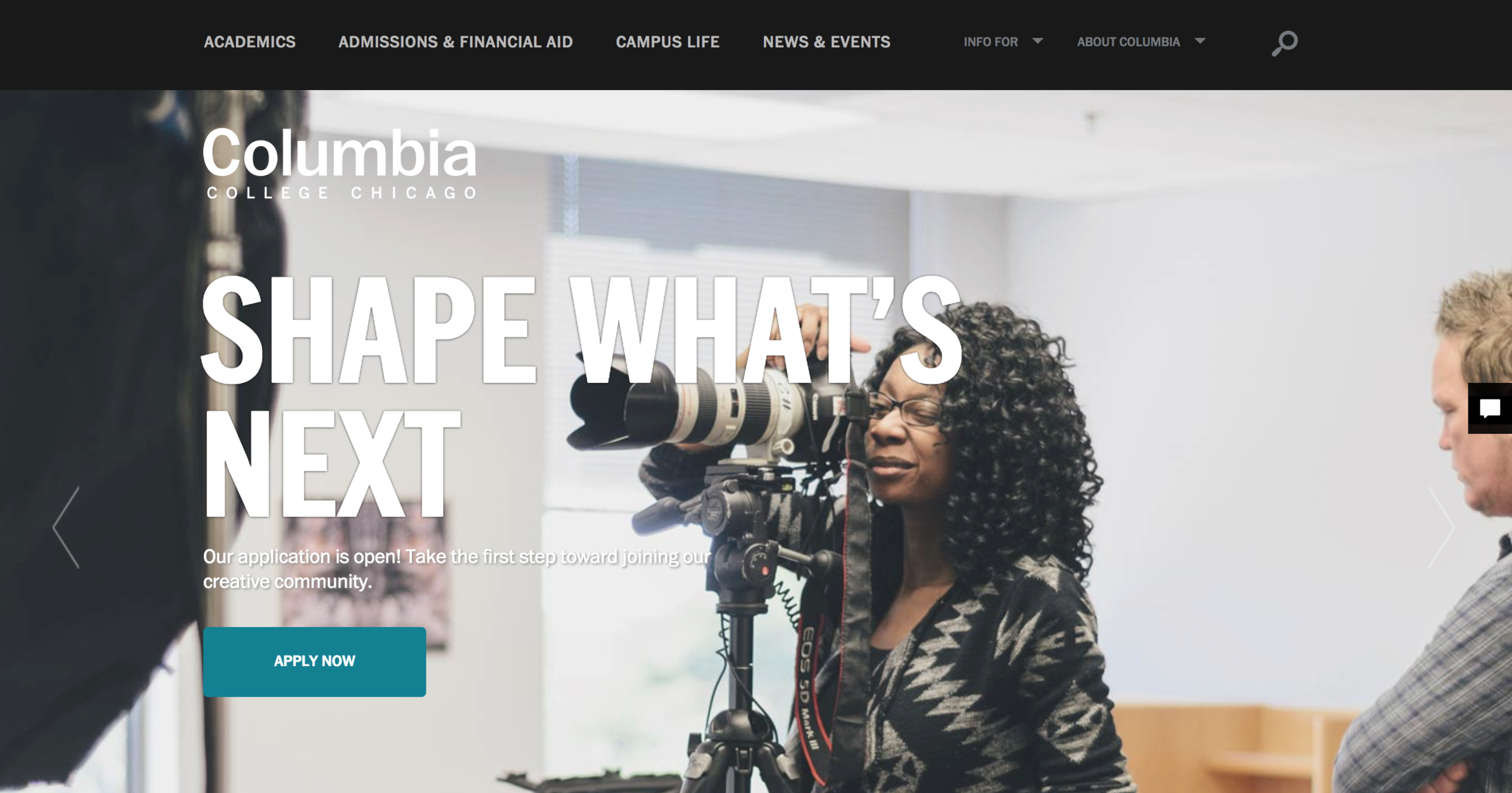
Redesigning the college’s home page gave me the opportunity to expand the amount of storytelling content to engage users, and to better highlight the “why” messaging for the college.
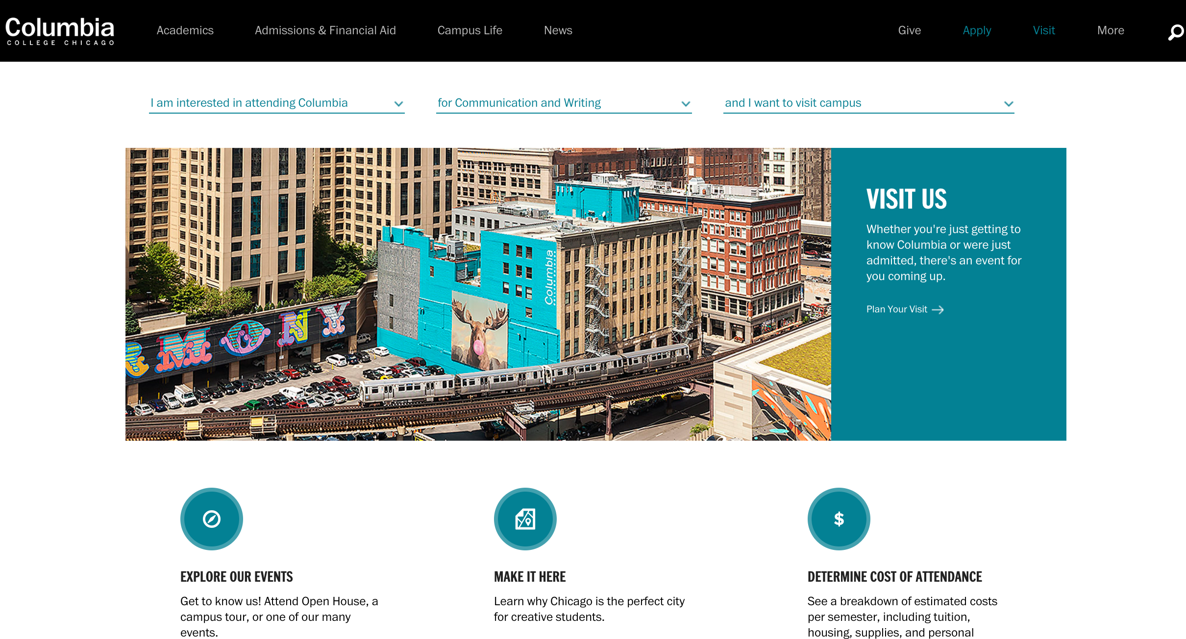
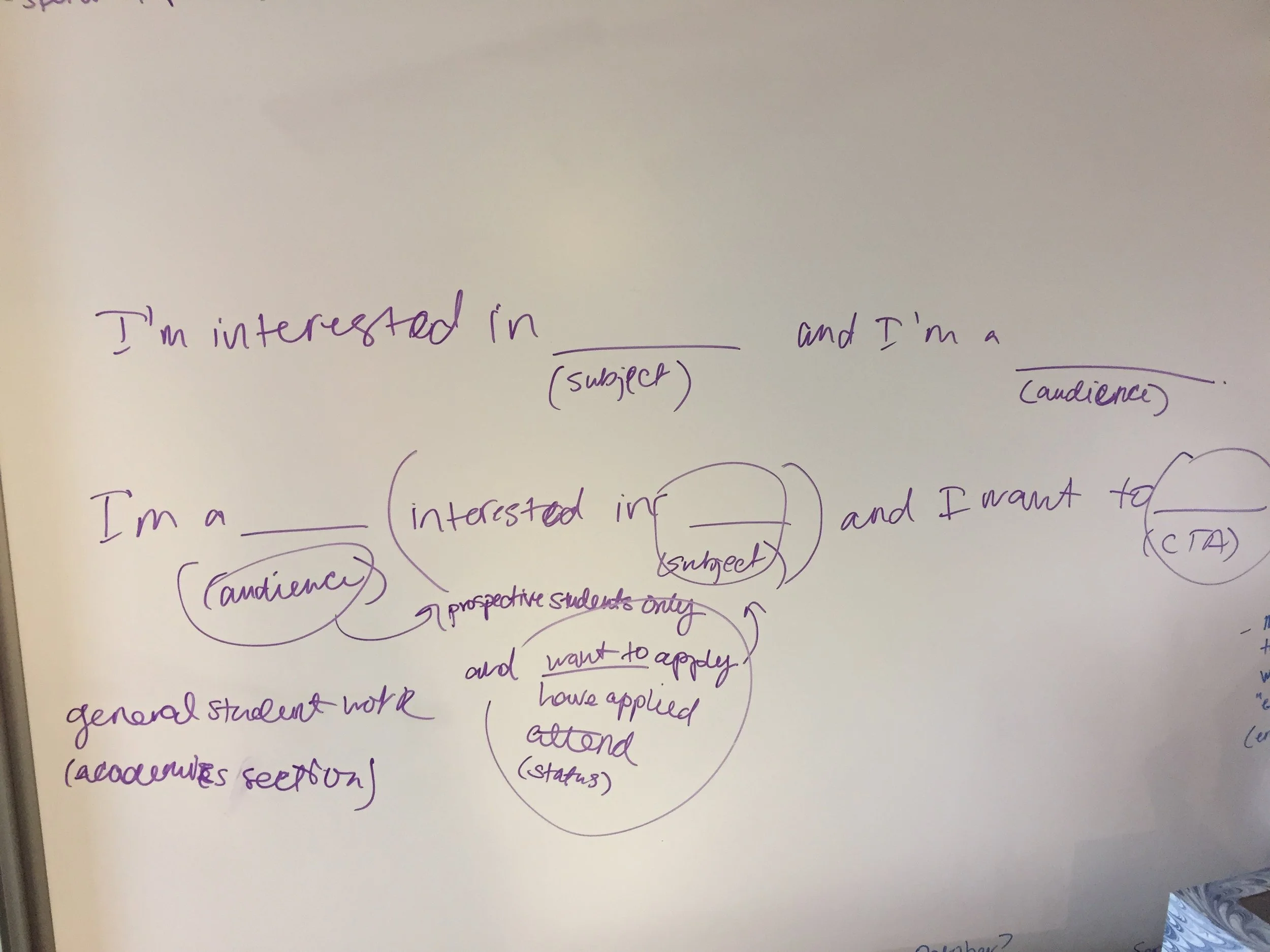
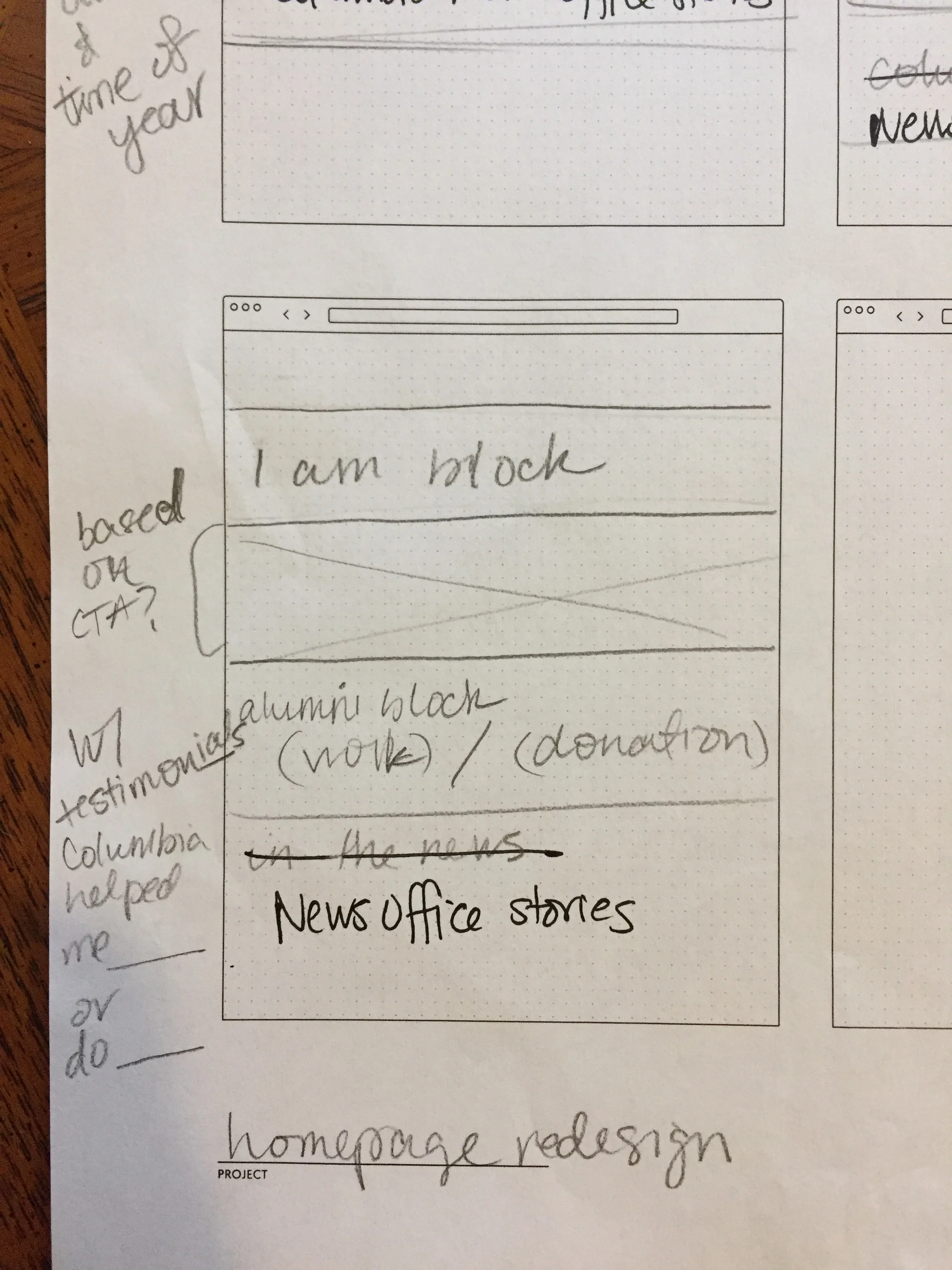
I started the process by focusing on different audiences and their intended tasks. There are significantly more user groups that use the website now versus when the website was redesigned in 2013, which focused primarily on prospective students. I had the idea to give users a menu of options that would change based on their role and task, which would also complement the navigation. I was responsible for working with stakeholders, performing audience background research, creating the interface designs, and determining tasks for each audience throughout the year.
My role
Researcher 🤔 / Designer ✍️ / Stakeholder liaison 🤝
Process
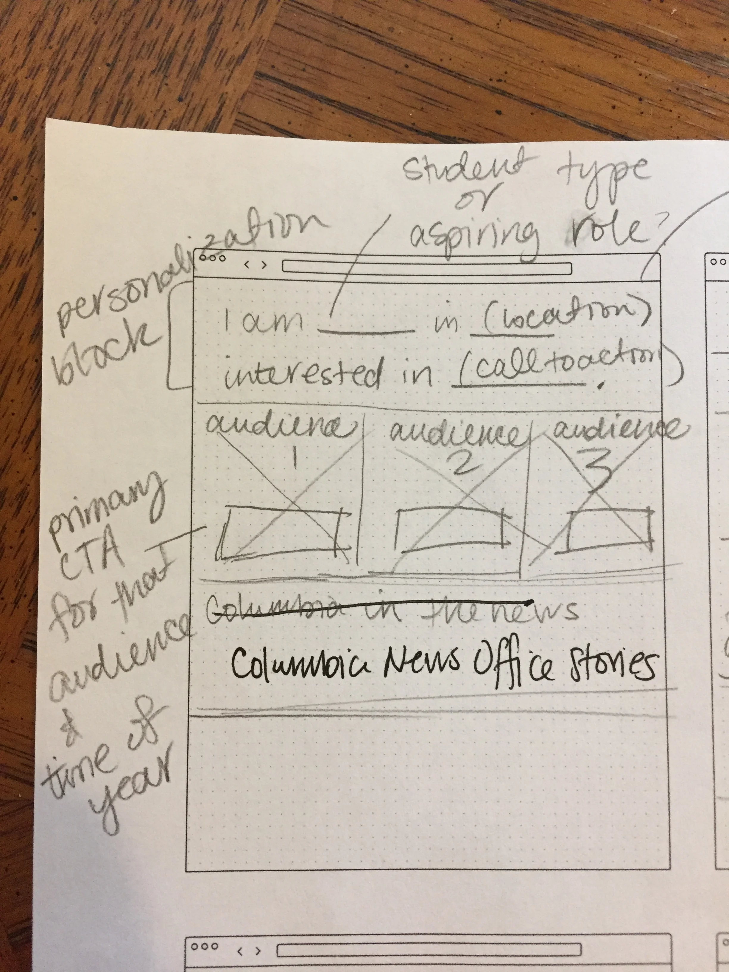
Reviewing the analytics showed that the homepage was used mostly as a gateway for the majority of website traffic, but it also showed the navigation was clear enough that people are comfortable using that. I developed new personas for all the primary audiences for the website — prospective students, parents, journalists, alumni, donors, and other influencers. This was instrumental in developing a content calendar with stakeholders and leading them through the redesign process. I created an initial design to prototype and test based on the top primary audiences (prospective students, current students, family members, and alumni). I worked with a visual designer and the developers to finalize the page, while I was responsible for all the research and the content development.
Outcomes
A more inclusive and dynamic homepage, where users navigate to apply and learn more about degree programs; including a 94% decrease in the bounce rate from the previous version, as well as an increase in the amount of time spent in each session.
Research methods
surveys
interviews
personas
wireframes
prototyping
